We started with the cedar tree, and reached for the meaning behind it while pushing past the overused visuals. The mark abstracts the tree into a geometric form that has the quiet confidence Cedar leads with.
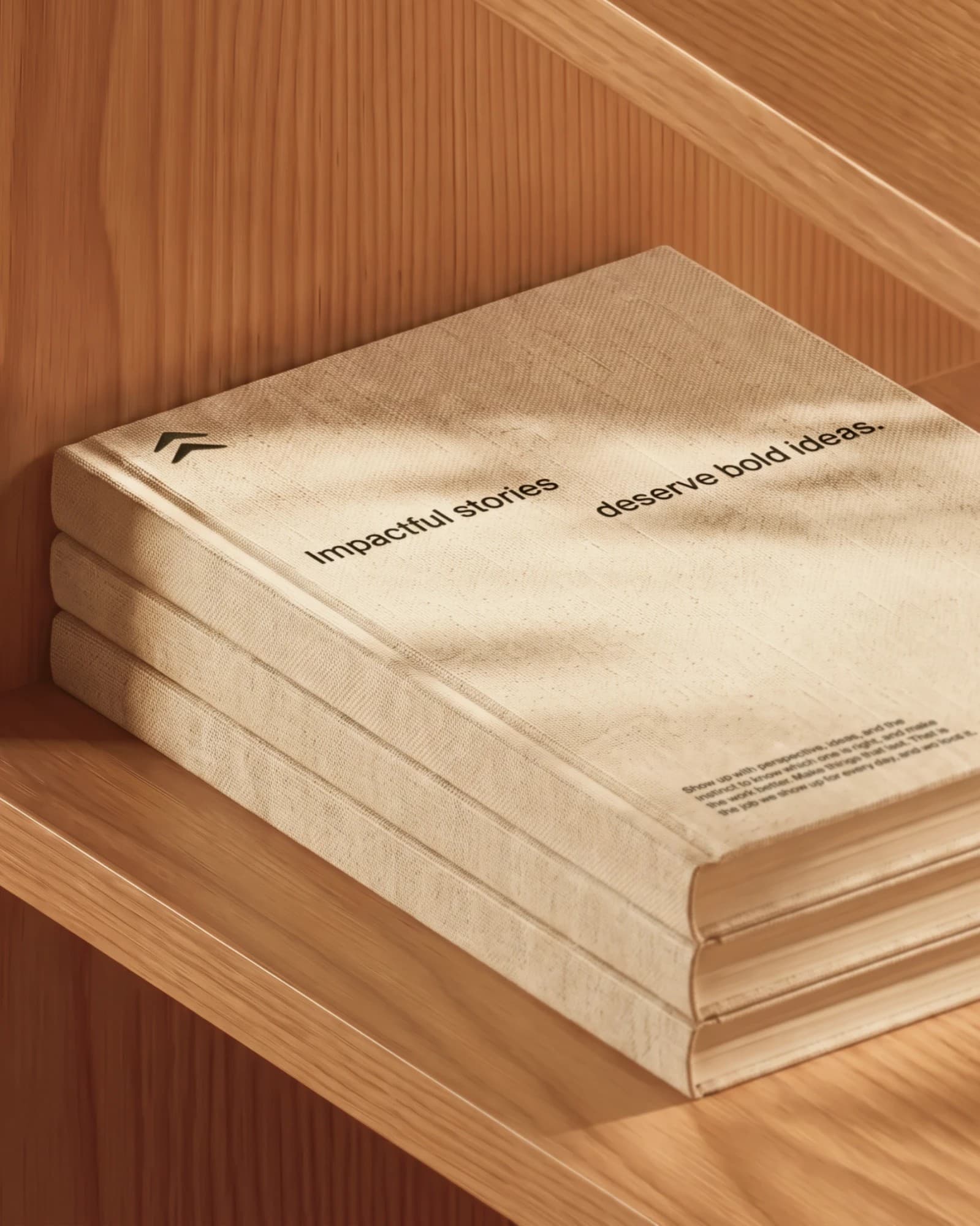
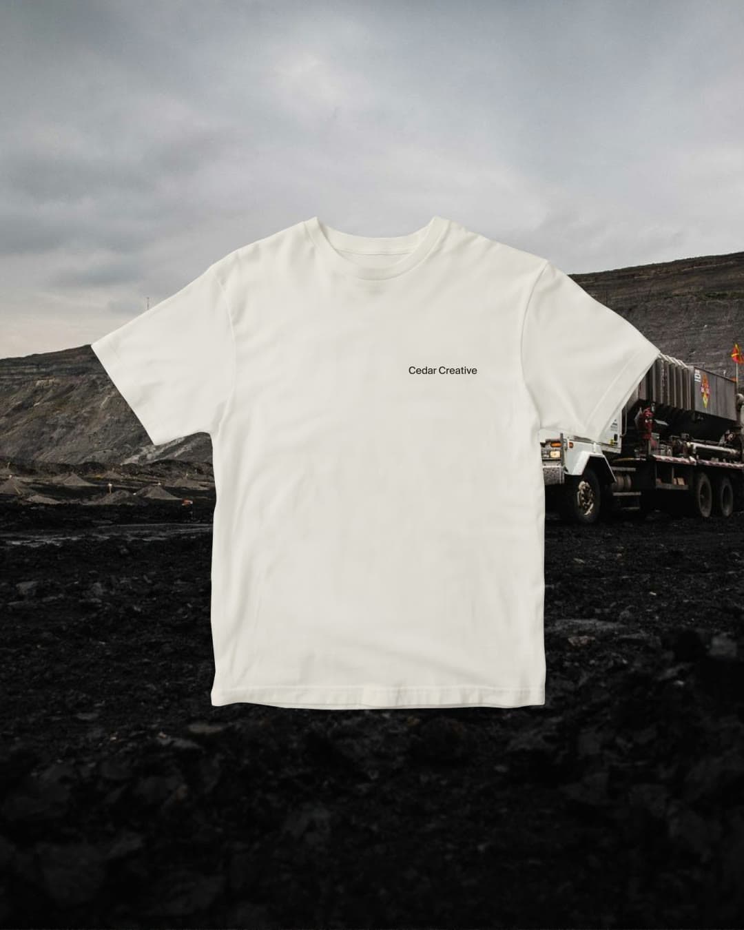
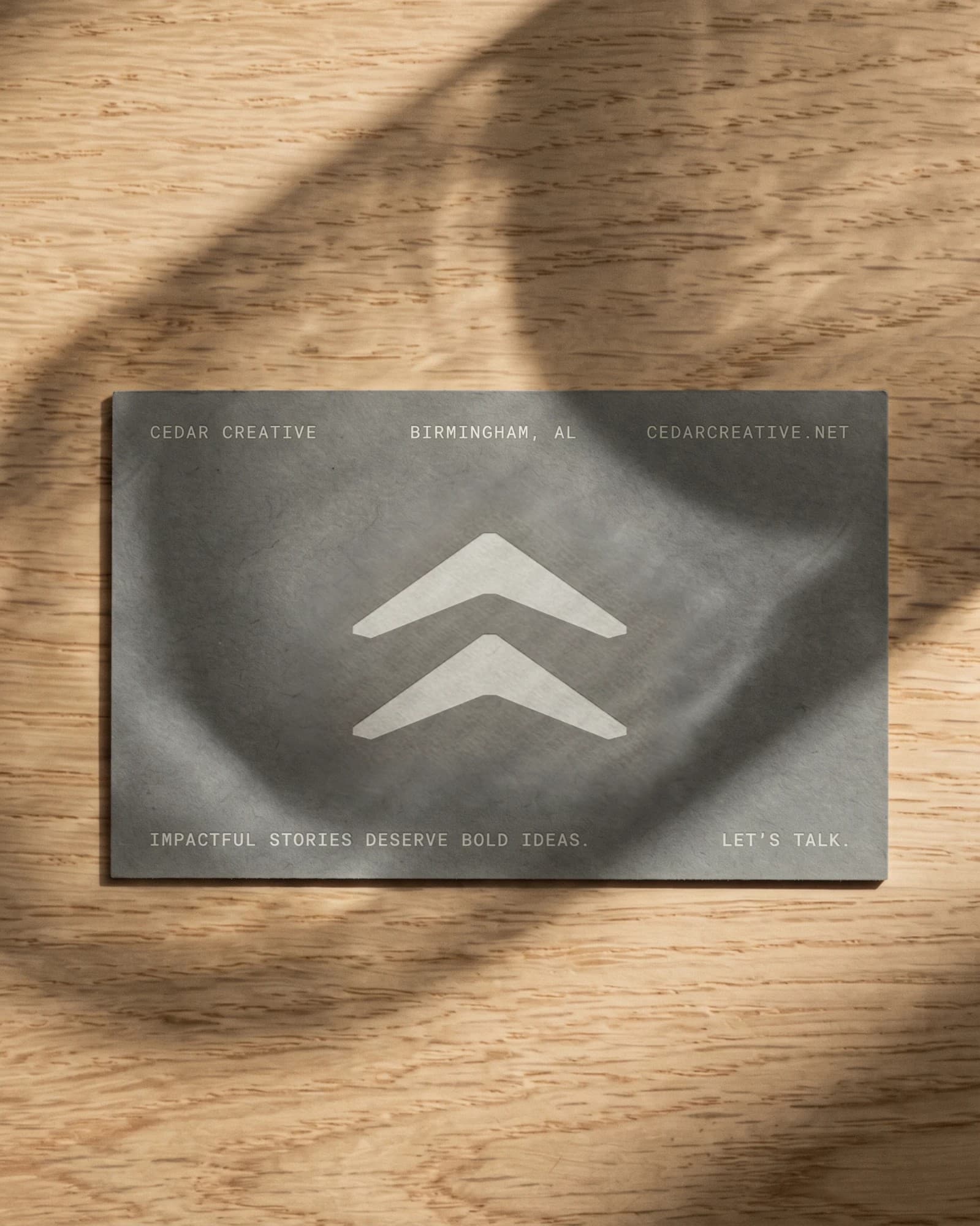
Working closely with the Cedar team, we built a full system around their balance of bold creative ideas and a confident restraint: responsive logo, icons, layout, messaging, and motion, all carried by a simple 10x10 grid system and one workhorse typeface, Suisse Int'l.
Cedar's work is exceptional, and the website needed to reflect that as well as Cedar's future trajectory.
More Work Our best work comes from working closely with founders and the experts on their teams. Here's the work we're proudest of, made with clients we're lucky to have.
 AxiosAxios is a strength and conditioning club whose standard comes before the aesthetics. We built a hard, technical identity in red against dirty grey and black, a badge for a mark, and the website that carries it.
 CaravanCaravan is an AI training company helping small and mid-sized teams put AI to work. We named it, built the brand system, and made a web tool that turns any photo into on-brand Caravan imagery.
 BHM AIBirmingham AI is a 501(c)(3) community in Birmingham, Alabama, where more than 800 people a month work out what AI means for their jobs. We built the compound brand, the website and the tools that let the team keep it all on brand.