Axios came to us asking for a website, and the diagnosis underneath it was a brand that read as a standard fitness group when the club itself holds its members to a higher standard.
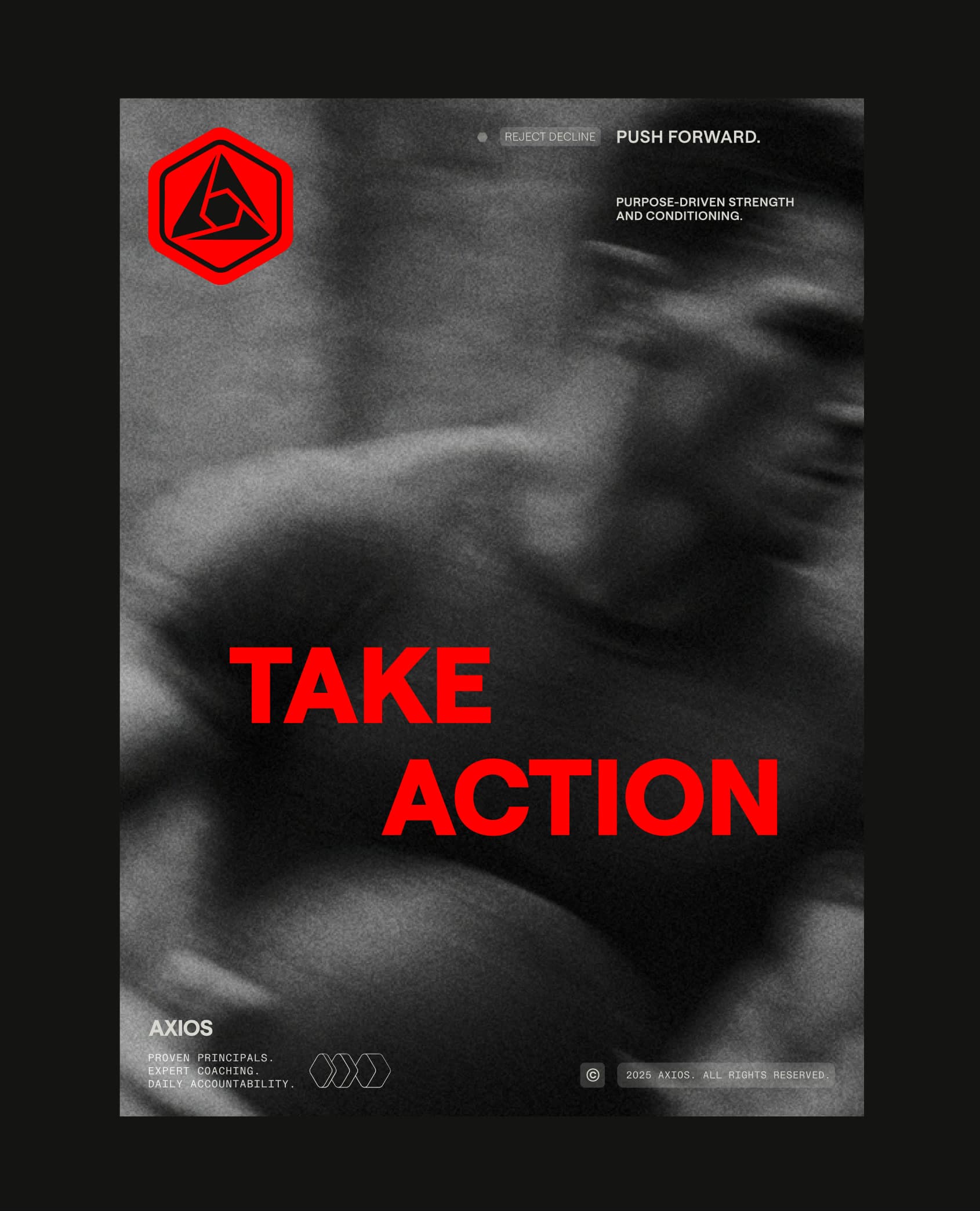
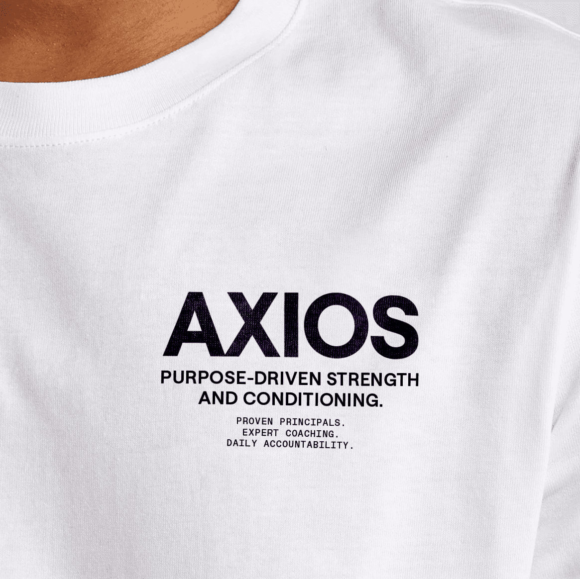
Working closely with JD, we built a system that reads like gear labeling rather than gym marketing: red against dirty grey, heather and black, Saans for the headlines, a monospaced face for the technical lines, and lockups built from hairlines and chevrons that carry the three pillars of every program wherever the mark goes.
The site had to carry the standard JD coaches to, and make a remote coaching business feel as robust as a gym with a front door.
More Work Our best work comes from working closely with founders and the experts on their teams. Here's the work we're proudest of, made with clients we're lucky to have.
 CaravanCaravan is an AI training company helping small and mid-sized teams put AI to work. We named it, built the brand system, and made a web tool that turns any photo into on-brand Caravan imagery.
 BHM AIBirmingham AI is a 501(c)(3) community in Birmingham, Alabama, where more than 800 people a month work out what AI means for their jobs. We built the compound brand, the website and the tools that let the team keep it all on brand.
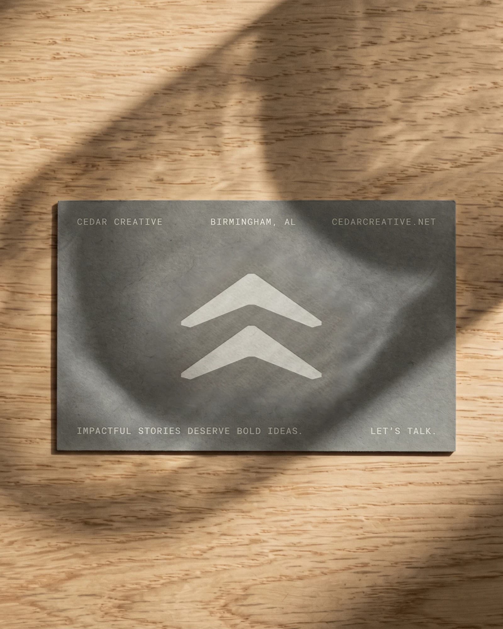 Cedar CreativeCedar Creative is a film production company in Birmingham whose work has always come first. We built a quiet, precise identity that lets the work speak, and a positioning that says what clients actually hire Cedar for.